Which clothing colors have the strongest impact in advertising?
- Jul 16, 2025
- 3 min read
The truth is, some colors impact us more than others. It's a natural part of how we perceive the world—and it applies to fashion too. Do you know which clothing colors create the strongest impact? Which ones draw our eyes to the model first? Find out now!
Clothing colors that drive sales
In the age of e-commerce, more and more fashion brands are moving online, showcasing their best looks to digital shoppers.
But as you know, for a customer to buy a piece of clothing, the photos need to be strong—because that’s the only thing they’ll see before deciding whether to add it to their cart or scroll on.
In other words, if an online store uses poor-quality photos or quick snapshots taken at home, the clothing might not look appealing—or the color might fail to make an impact. Worse yet, the customer could feel misled if what they receive doesn’t match the image.
To avoid this—and to protect your brand’s reputation—it’s crucial to invest not only in advertising that reaches more potential clients, but also in professional fashion photography. And choosing the right colors that resonate with your buyer persona is key.
Here are the colors that make the strongest impact (even if you don’t realize it):
1- Red: the color of passion and boldness
Red clothing always stands out. It’s a color widely used in advertising because it conveys strength, intensity, and boldness—plus, it’s incredibly flattering. It’s a safe bet when planning an ad campaign, so try incorporating a red piece into your next shoot!
2- Blue
Blue is the color of calm. It’s a neutral, cool tone that evokes tranquility. It doesn’t grab attention as instantly as red, but it’s a favorite color for many. So, if you’re investing in advertising for your store, make sure to include shades of blue.
Many people also stick to a few safe colors when dressing, so using blue is a smart way to reach a broader audience.
TIP: Light blue, or sky blue, is one of the most popular colors in children’s fashion.
3- Purple
Purple has become one of women’s favorite colors. It’s a growing trend in advertising and can generate a high number of clicks.
Why purple? It not only represents International Women’s Day (March 8), but it’s also linked to campaigns like breast cancer awareness. It goes without saying that purple is a romantic, sweet, and feminine tone that has notably replaced pink.
4- Neon or fluorescent colors
Neon colors aren’t always in season, but when they are, they’re everywhere. They’re truly eye-catching, with bright yellows, greens, and fluorescent pinks leading the way—three shades you’ll often see in neon.
As a tip, neon tones are especially popular with young female audiences, mainly teenagers. If your target is a youthful crowd, go bold with fluorescent colors in your advertising.
5- Play with contrasts
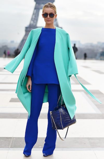
A trick to capture the consumer’s attention is to play with contrasts. This way, they’ll encounter something unexpected and turn their head to take a closer look. It’s an advertising technique in fashion that works really well.
One example of this is the following photo. It might be a bold outfit for you, one you’d never wear, but you’ll definitely look at it—and you might even like it.
Another great bet is the following:
Additionally, being cheerful tones, they instantly immerse us in spring. Therefore, it’s important to choose clothing colors that align with the month we’re in.
6- Fashion trend color or Pantone Color of the Year
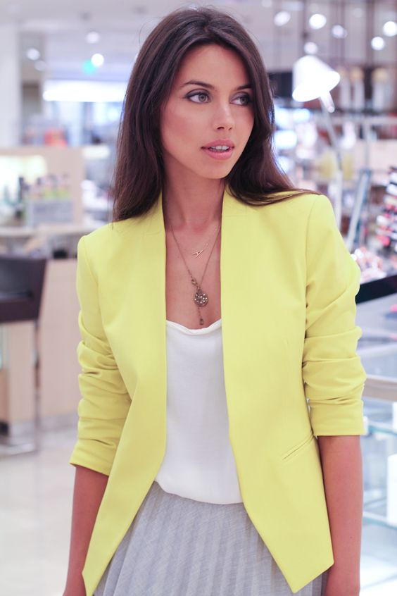
Every year, there are certain colors that dominate, and it’s essential to include them in your collection, just as Pantone shades should not be overlooked. For 2021, we have PANTONE 17-5104 Ultimate Gray + PANTONE 13-0647 Illuminating, a combination of yellow and gray.
For instance, a fashionable outfit for 2021 could look something like this:
Has any of these shades surprised you? Don’t hesitate to incorporate them into your advertising campaigns. You’ll see how conversions increase!


Excelente contenido, muy informativo y visualmente agradable. Valoro mucho cuando se presta atención a la presentación. Relacionado con esto, siempre me ha fascinado la fluidez de las letras ligadas. Hace poco encontré una web que desglosa el alfabeto cursivo letra por letra, ideal para aprender los trazos correctos. Ha sido una herramienta muy útil para mejorar la legibilidad y estética de mis notas personales, complementando la búsqueda de calidad que este blog inspira.